GHGSAT
How to illustrate the past, present and future on the same map? How to identify trends, express games of scale and address populations from various countries, all on a single, fun and colorful interface? Here is the design system, data representation and localization mission that we identified.
Date of conceptualization
2021/2022
Client
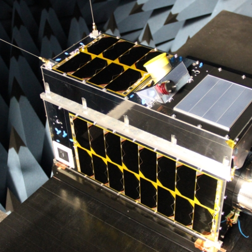
GHGSat: GHG emissions seen from the sky
A start-up with a good purpose, GHGSat leases satellites to polluting industries, governments and regulatory agencies to detect and measure unwanted gas emissions.
In addition to this, it provides an interface that allows you to observe and collect data in real time, all with a view to:
- Spot leaks
- Be alerted in real time
- Monitor GHG (greenhouse gas) emissions quotas
- Act and inform live on the ground
- Detecting a “malfunction” of infrastructure
Mission
“Rare are the projects where we are convinced that we have a real impact. And participating in that is very rewarding! »
Perrine, Designer UI
In the industry, we describe these projects as fascinating, cutting-edge and rich because they are complex. When the start-up GHGSat approached us to improve and simplify their customer interfaces, we did not yet realize where all this experience would take us or how close technology can be to humans.
Create a simple and accessible platform
“The whole challenge of our mission was to create a system flexible enough for a beginner to immediately identify what is important, without having any scientific knowledge. »
Jean-François, UX lead and mentor
Going from 22 screens to only 4 required, of course, simplified the experience, but also reduced the training time for new employees as well as greatly reducing the margin of error for users.
Throughout this process, the support of the GHGSat team made up of astrophysicists and led by Emilie Hamel, vice-president of operations, was very valuable, in addition to being extremely enriching. For us, the humility of these people and the multicultural aspect of their team were a real motivation to excel!
Sometimes with a 14-hour time difference, we tested the map and its 7 layers of data (including several colors and symbols) in the company of 7 people with varied accents and origins!
Gamify the dashboard & create a complete Design System
How to illustrate the past, present and future on the same map? How can we identify trends, express scale effects (global overview in the air, precise overview of infrastructures on the ground) and address populations from various countries, all on a single, fun and colorful interface?
Vhere is the design system, data representation and localization challenge that we took on.
As such, the complexity of GHGSat's 3D interfaces lies in translating spatial, temporal and industrial data on the same plane. Thus, we were particularly challenged in terms of the different layers of information to map as well as the visual language to design so that it works everywhere in the world.
In the end, in a year and a half we designed all the interfaces allowing employees to coordinate the satellites of customer contracts and all the satellite image management interfaces. A considerable and successful gamble!
The project team
- Jean-François, in UX design and lead
- Perrine, in charge of UI design
- Gabrielle-Jade and Myriam, in charge of user testing
- Olivier and Caroline, for observation and analysis
“This is one of my favorite projects to date, I’ll do it again anytime! It’s not every day that I check company news, but their LinkedIn impresses me! »
Perrine